Web Performance Checklist for Core Web Vitals - LCP, INP, and CLS
First Published:
Last Updated:
This article is a checklist-style reference for engineers and SEO-minded site operators who want to systematically improve Core Web Vitals on a real production site without getting lost in framework-specific advice or year-tagged blog posts that age out within twelve months. The recommendations here are anchored in patterns I have validated on hidekazu-konishi.com — a static site on Amazon S3 and Amazon CloudFront — and the code excerpts are drawn primarily from that production source, supplemented where the discussion benefits from a broader view. The goal is to give you a single page you can revisit annually, run through top to bottom, and treat as the asset that outlives whichever bundler is fashionable this quarter.
For readers who have not yet stood up the underlying static stack, my earlier companion article on How to create a PWA(Progressive Web Apps) compatible website on AWS and use Lighthouse Report Viewer walks through the bucket, distribution, certificate, and Lighthouse-100 baseline. The Website Speed Test tool on the same site gives you a one-click way to verify any URL against PageSpeed Insights without leaving the browser.
Why Core Web Vitals Still Matter
It is tempting to look at a metric set that has been promoted heavily by one search engine for several years and assume it has stabilized into background noise. The opposite is true. Core Web Vitals continue to evolve — First Input Delay was retired in March 2024 and replaced by Interaction to Next Paint, which captures the full interaction lifecycle rather than just the first input — and the thresholds remain tighter than the field actually meets at any scale. According to the Web Almanac 2024 Performance chapter (the most recent edition cited throughout this article; verify against the latest edition at almanac.httparchive.org when reviewing), only 43% of mobile sites achieve "good" on all three Core Web Vitals together, and 54% of desktop sites, despite years of attention. The opportunity for a serious operator to differentiate on page experience is therefore still wide open.The second reason these metrics matter is that they are field-measured, not lab-measured. Every active Chrome user with default settings contributes anonymized real-user metrics to the Chrome User Experience Report (CrUX), and Search Console surfaces those numbers per page group. This means an optimization that passes Lighthouse but fails on real devices, real networks, and real users will show up as poor in CrUX, and Lighthouse-only validation is therefore insufficient. A complete performance program needs both lab data — for repeatable regression checks in CI — and field data — for the source of truth that affects rankings.
The third reason is that the metrics are stable enough to optimize against. The thresholds have not moved since INP replaced FID, the measurement methodology is well-documented, and the underlying APIs are shipping in all major browsers. Effort spent on Core Web Vitals today does not become wasted next quarter. That is precisely the property that makes this article worth turning into an annual review checklist rather than a one-time read.
Core Web Vitals Refresher (LCP, INP, CLS)
Before getting into the optimizations, make sure the definitions are precise. Imprecise mental models are the most common cause of optimizations that do not move the metric.Largest Contentful Paint (LCP)
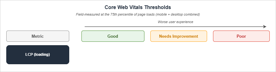
LCP measures the render time of the largest image or text block visible within the viewport, relative to when the page first started loading. The Good threshold is 2.5 seconds or less, the Poor threshold is greater than 4.0 seconds, and the band between is "Needs Improvement". Per web.dev, "It is important to note that LCP includes any unload time from the previous page, connection set up time, redirect time, and other Time To First Byte (TTFB) delays which can be significant when measured in the field."LCP decomposes into four sequential sub-parts that always sum to the full LCP time, with no overlap or gap. Per the optimize-LCP guide, the typical distribution on real sites is:
| Sub-part | Definition | Typical share |
|---|---|---|
| Time to First Byte | From navigation start until the first byte of the HTML response. | ~40% |
| Resource Load Delay | From TTFB until the browser starts loading the LCP resource. | <10% |
| Resource Load Duration | The duration of loading the LCP resource itself. | ~40% |
| Element Render Delay | From when the LCP resource finishes loading until the LCP element is fully rendered. | <10% |
The implication is that for most real sites, LCP is dominated by TTFB and resource transfer time, while resource-load-delay and element-render-delay are short tails. Optimizing LCP is therefore mostly about server response and getting the LCP resource on the wire as early as possible.
According to the Web Almanac 2024, 83.3% of pages on desktop and 73.3% on mobile have an image as the LCP content type. Practically, this means LCP optimization is image optimization for most sites, and
<h1> text is the secondary case.Interaction to Next Paint (INP)
INP, which fully replaced First Input Delay in 2024, measures interaction responsiveness. For each user interaction (click, tap, key press), the browser records the latency from the input event until the next visual frame. INP reports the highest such latency observed on the page, with one outlier dropped per fifty interactions for long sessions.The Good threshold is 200 milliseconds or less, the Needs Improvement band is above 200 ms and below or at 500 ms, and Poor is above 500 ms. INP decomposes into three parts:
| Sub-part | Definition |
|---|---|
| Input Delay | The time before any callback for an interaction is handled (typically waiting on the main thread). |
| Processing Duration | The time for all the callbacks of the interaction to execute. |
| Presentation Delay | The time from after the callbacks have executed until the next frame is presented on the user's screen. |
The single most useful framing for INP is that the main thread is shared between page rendering, user-script callbacks, and third-party scripts, and any long task — a JavaScript execution lasting more than 50 ms — blocks every interaction queued behind it. INP optimization is therefore mostly long-task elimination.
The 2024 Web Almanac reports that 74% of mobile sites and 97% of desktop sites pass INP, so on desktop INP is largely a solved problem and on mobile it is still where the biggest wins are.
Cumulative Layout Shift (CLS)
CLS measures visual stability. It is the sum, within a "session window", of all unexpected layout shifts that occur during the page's lifetime. A layout shift score is calculated asimpact fraction × distance fraction, where the impact fraction is the share of the viewport affected by the shift and the distance fraction is the largest movement (horizontal or vertical) of the unstable element relative to the viewport's longest dimension.A session window starts at the first layout shift, includes any further shifts that occur with less than 1 second since the last shift, and closes either when the 1-second gap is exceeded or after a maximum of 5 seconds. The reported CLS for the page is the largest session window's score.
| Threshold | Value |
|---|---|
| Good | 0.1 or less |
| Needs Improvement | 0.1 to 0.25 |
| Poor | greater than 0.25 |
Per the Web Almanac 2024, 79% of mobile sites and 72% of desktop sites pass CLS. The desktop number is interesting because larger viewports tend to amplify shifts that would be small on mobile, and embedded media that lacks reserved space is a common offender.
Field vs Lab Data
All three thresholds are evaluated at the 75th percentile of page loads, segmented across mobile and desktop. This is the key methodological detail that separates lab data from field data: a Lighthouse run on your laptop is one synthetic page load on a fast network with a fresh cache, while CrUX aggregates 28 days of real loads from real devices on real networks. A site that hits Lighthouse 100 in the lab can still fail Core Web Vitals in CrUX if its 75th-percentile real users are on slower devices than your simulation. Always validate against field data before declaring an optimization successful.LCP Checklist (Largest Contentful Paint)
Optimizing LCP is a four-stage funnel. Walk down the list in order — earlier items have the biggest leverage — and stop when the metric is in the Good band on field data.TTFB: Server Response Time
- Serve from a CDN edge close to your readers. For a static site, the work is the CloudFront / Cloudflare / Fastly distribution that already serves the HTML. Cache the HTML itself, not just images and CSS. On hidekazu-konishi.com the HTML is cacheable because there is no per-user content, and the edge serves bytes in tens of milliseconds for any geography.
- Minimize redirects on the LCP path. Each
301adds at least one round trip. Audit the canonical URL of every entry point — homepage, every blog post — and confirm that the URL the user actually types or that the search engine indexes returns200directly, not after a redirect chain. - Eliminate the HTTP-to-HTTPS redirect on the navigation path with HSTS. Serving the
Strict-Transport-Securityresponse header with a longmax-agetells the browser to upgrade subsequenthttp://requests tohttps://client-side, so the first visit still pays the redirect but the second and beyond do not. To eliminate the cost on the very first visit as well, add thepreloaddirective (along withincludeSubDomains) and submit your domain to hstspreload.org for inclusion in the HSTS preload list shipped with Chromium, Firefox, and Safari. Once on the list, no browser ever issues thehttp://request, even on first contact. - Compress HTML with Brotli. CloudFront supports automatic Brotli for
text/htmlwhen the request hasAccept-Encoding: br, which all modern browsers send. Verify withcurl -H 'Accept-Encoding: br, gzip' -Ithat the response includescontent-encoding: br. - Inline critical CSS so the response can render before the stylesheet is fetched. See the Critical CSS section below.
- Avoid synchronous server-side work on the HTML response. For dynamic pages, run analytics, A/B test assignment, and personalization in client-side scripts after first paint, not before the HTML is flushed.
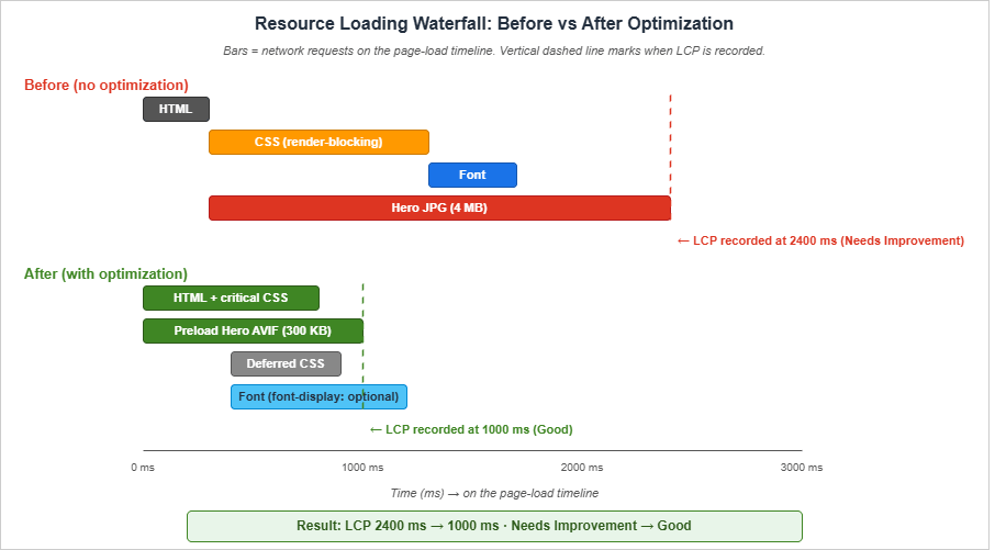
Resource Load Delay: Discover the LCP Resource Early
The browser cannot start downloading the LCP image until it has parsed the HTML far enough to discover the<img> tag — unless you tell it earlier with a preload.- Preload the LCP image with
fetchpriority="high"if the resource is referenced from CSS (background image) or rendered after JavaScript:
<link rel="preload" fetchpriority="high" as="image" href="/images/hero.avif" type="image/avif">
- Set
fetchpriority="high"on the LCP<img>tag when the image is in the static HTML. Adoption of this attribute has grown to roughly 15% of mobile pages in 2024 according to the Web Almanac, up from 0.03% in 2022 — a useful signal that this is the modern path.
<img src="/images/hero.avif" alt="..." fetchpriority="high" width="1280" height="720">
- Use
<link rel="preconnect">for cross-origin LCP resources. If the LCP image is on a CDN host different from the HTML, preconnect to the CDN host so the TLS handshake completes during HTML parse. Limit preconnect to two or three origins; more dilutes the benefit. - Avoid
loading="lazy"on the LCP image. Lazy loading defers the request, which is precisely the opposite of what you want for the LCP element. Lazy loading is correct for below-the-fold images, never for the hero.
Resource Load Duration: Make the LCP Resource Smaller
- Serve modern image formats (AVIF, WebP) with
<picture>source order. AVIF is typically 25–35% smaller than WebP at equivalent quality, and WebP is typically 25–35% smaller than JPEG. Use the Image Optimization checklist below for the full pattern. - Size the LCP image to the actual rendered size. A 4K hero image rendered at 1280×720 wastes 90% of the bytes. Use
srcsetandsizesto pick the right resolution per viewport. - Compress aggressively. AVIF and WebP at quality 75 are visually indistinguishable from JPEG quality 95 in nearly all cases.
- Serve from the same origin as the HTML when possible. Per the optimize-LCP guide, "Serving images from the same origin as your HTML when possible" is preferred because third-party domains require additional connection setup that preconnecting only partially mitigates.
Element Render Delay: Eliminate Render-Blocking Resources
- Inline critical CSS in
<head>so the first paint does not wait on a stylesheet round trip. Defer the rest with a<link rel="stylesheet">placed at the end of the head or marked withmedia="print" onload="this.media='all'"for true async. - Defer non-critical JavaScript with
deferon every<script>tag. On hidekazu-konishi.com, both scripts at the body end usedefer:
<script src="https://hidekazu-konishi.com/index.js" defer></script>
<script src="https://hidekazu-konishi.com/js/common-utils.js" defer></script>
- Avoid
<script>tags in<head>withoutasyncordefer. Per web.dev, "It is almost never necessary to add synchronous scripts to the<head>." - Avoid web fonts that delay text render. Use
font-display: swaporfont-display: optionalso the fallback text paints immediately. See the Font Loading section below. - Avoid CSS
@importchains. Each@importblocks subsequent CSS until the imported file finishes downloading. Concatenate at build time or use a single stylesheet.
INP Checklist (Interaction to Next Paint)
INP optimization is mostly about keeping the main thread free for interaction handlers. Where LCP rewards getting bytes on the wire early, INP rewards keeping the JavaScript work small per interaction and yielding to the browser frequently.Reduce Input Delay
- Eliminate long tasks on the main thread. A long task is any task lasting more than 50 ms. Use the Performance panel in DevTools to find them, and break them up with
await scheduler.yield(),requestIdleCallback, orsetTimeout(fn, 0)between chunks. - Defer non-critical third-party scripts. Analytics, ad scripts, and social embeds typically have main-thread costs that block interactions. Load them with
deferat minimum, orasyncif they have no DOM dependency, or — best — load them inside an<iframe>so they cannot block the parent's main thread. - Avoid synchronous client-side hydration. Frameworks that perform a single large hydration step on initial load can produce input delays in the hundreds of milliseconds. Prefer streaming or partial hydration where the framework supports it.
- Move heavy JS to a Web Worker. Anything that does not need the DOM — JSON parsing of large payloads, cryptography, image processing — can run off the main thread.
Reduce Processing Duration
- Keep event handlers small. A click handler that does 100 ms of synchronous work will register as 100 ms of processing duration on every click. If the work is unavoidable, schedule the heavy part with
requestIdleCallbackand immediately return from the handler so the next paint can occur. - Debounce input handlers. A keystroke handler that triggers expensive work on every keypress will produce poor INP. Debounce to 100–150 ms and run the heavy work once per pause.
- Avoid forced synchronous layout. Reading layout properties (
offsetTop,getBoundingClientRect) inside an event handler that has just mutated the DOM forces a synchronous reflow. Batch reads first, then writes. - Use the Long Animation Frames API (LoAF) to find INP root causes. Long Tasks API (
longtask) only tells you that a task exceeded 50 ms; it does not say which script started it, which subtasks contributed, or which paint phase it blocked. LoAF (long-animation-frame, GA in Chromium since 2024) reports per-frame durations broken down by render time, layout time, style time, and a list of contributing scripts with attribution to source URL, function name, and invoker type. This is the modern primary tool for INP triage:
// Observe long animation frames (frames whose duration exceeds 50 ms)
const observer = new PerformanceObserver((list) => {
  for (const entry of list.getEntries()) {
    if (entry.duration > 50) {
      console.log({
        duration: entry.duration,
        renderStart: entry.renderStart,
        styleAndLayoutStart: entry.styleAndLayoutStart,
        scripts: entry.scripts.map((s) => ({
          name: s.name,
          duration: s.duration,
          sourceURL: s.sourceURL,
          sourceFunctionName: s.sourceFunctionName,
        })),
      });
    }
  }
});
observer.observe({ type: 'long-animation-frame', buffered: true });
The
scripts array is the value — it tells you exactly which third-party tag, framework hook, or callback caused the frame to overrun. Pipe these entries to your RUM endpoint alongside onINP() and you can correlate the worst observed interaction back to a specific script in production rather than guessing from a synthetic Lighthouse trace.Reduce Presentation Delay
- Minimize the work the browser has to do to paint the next frame. Large DOM trees, complex CSS selectors, and excessive shadows or filters all increase paint time.
- Use
content-visibility: autoon offscreen sections to skip their layout and paint until they scroll into view. The visual result is identical; the layout cost is moved out of the input → frame critical path. - Avoid layout thrashing in animation handlers. Animate transform and opacity, which the compositor can handle off the main thread, instead of
top/left/width/heightwhich trigger layout.
CLS Checklist (Cumulative Layout Shift)
CLS is the easiest of the three to optimize because nearly every cause is a missing dimension or a missing reservation. Walk through this list once per template and CLS becomes a non-issue.Reserve Space for Media
- Always set
widthandheighton<img>tags. The browser uses the ratio to reserve the correct aspect-ratio box during layout, even before the image bytes arrive. Without these, a typical mobile hero image causes a 0.05+ shift on first paint. - Always set
widthandheighton<video>tags. Same rule. - Reserve a min-height for ad slots and embeds. A YouTube embed without a wrapper height will cause a multi-hundred-pixel shift when the iframe loads.
- Use
aspect-ratioCSS for fluid images. When the rendered size depends on viewport width, setaspect-ratio: 16 / 9(or whatever) on the image so the box is reserved correctly at any width.
Stabilize Web Fonts
- Use
font-display: optionalfor body text fonts. This causes the fallback to render and stay if the web font does not load within 100 ms, eliminating the swap-in shift entirely. The trade-off is that some users may never see the web font; for body text on a content site this is usually fine. - Use
size-adjustandascent-overrideon the fallback font so the fallback metrics match the web font as closely as possible. The CSS Fonts Level 4 properties make this practical without writing custom font subsets.
@font-face {
  font-family: "FallbackInter";
  src: local("Arial");
  size-adjust: 107%;
  ascent-override: 90%;
  descent-override: 22%;
}
body { font-family: "Inter", "FallbackInter", sans-serif; }
Avoid Dynamic Insertion Above Existing Content
- Never inject content above the fold after first paint without reserving space for it. Cookie banners, A/B test variations, and dynamic notices are the most common offenders. Either render them server-side or position them with
position: fixedso they do not affect document flow. - Defer announcement banners until after
load. A 0.05 shift at the top of the page during load registers as the largest session window's score and pushes a passing site into Needs Improvement. - Use CSS
transformfor in-place animations. Transform changes do not trigger layout shifts;top/margin/heightchanges do.
Audit With the DevTools Layout Shift Region Highlighter
- Run a Lighthouse audit and look at the "Avoid large layout shifts" diagnostic. Lighthouse highlights the specific elements that contributed to CLS during the audit run.
- In Performance > Experience, enable "Layout Shift Regions" while reloading the page. The regions flash blue at the moment of the shift, which makes it easy to identify the offending element by eye.
Use the View Transitions API for In-Page and Cross-Document Transitions
The View Transitions API turns content swaps that historically registered as layout shifts — route changes in a SPA, filter applications, modal opens — into snapshot-based animated transitions that contribute zero to CLS. The browser snapshots the old state, applies the DOM mutation, snapshots the new state, and crossfades between them via the user agent's compositor. The snapshots are not part of the document, so there is no layout shift to measure.For same-document transitions (Chromium 111+, Safari 18+):
function navigate(newContent) {
  if (!document.startViewTransition) {
    applyContent(newContent);
    return;
  }
  document.startViewTransition(() => applyContent(newContent));
}
For cross-document transitions on multi-page apps (Chromium 126+), declare opt-in CSS in both the source and destination pages, no JavaScript required:
@view-transition { navigation: auto; }
The cross-document variant is the one most relevant to a static blog: navigations between articles on the same origin become animated transitions for free, with zero CLS impact and no client-side router. Pair this with Speculation Rules (below) to make the transition feel instant in addition to looking smooth.
Image Optimization (AVIF, WebP, Responsive Images, and Lazy Loading)
Images are the single largest payload category on most pages and the LCP element on three-quarters of pages. Spend time here before anywhere else.Choose Modern Formats With <picture>
The <picture> element lets the browser pick the best supported format from a prioritized list. The recommended order in 2026 is AVIF first, then WebP, then a JPEG or PNG fallback for older browsers:<picture>
<source type="image/avif" srcset="/images/hero.avif">
<source type="image/webp" srcset="/images/hero.webp">
<img src="/images/hero.jpg" alt="..." width="1280" height="720" fetchpriority="high">
</picture>
The
<img> tag inside <picture> is what every browser actually renders — it is the source of truth for alt, width, height, and fetchpriority. The <source> elements just tell the browser which file to fetch given its format support.According to the Web Almanac 2024, JPEG and PNG together still account for 87% of images on the web, WebP is at 7%, and AVIF is at 0.3%. The format mix is shifting slowly, but the gap between adoption and the technical wins available is exactly the opportunity for individual operators willing to do the work.
Responsive Images With srcset and sizes
For images that render at different sizes across viewports, give the browser a list of resolutions and a hint about how wide the image renders:<img
src="/images/hero-1280.avif"
srcset="/images/hero-640.avif 640w, /images/hero-1280.avif 1280w, /images/hero-1920.avif 1920w"
sizes="(min-width: 1024px) 1280px, 100vw"
alt="..."
width="1280" height="720"
fetchpriority="high">
The
sizes value is a media-query-driven hint for how wide the image will be rendered at each viewport. The browser combines this with device pixel ratio to pick the smallest srcset entry that satisfies the rendered size.Lazy-Load Below-the-Fold Images Only
- Add
loading="lazy"to every image below the fold. This defers the network request until the image is close to the viewport. - Do not lazy-load the LCP image. The LCP image, by definition, is in the initial viewport, and lazy-loading it produces a worse LCP than not lazy-loading.
- Set
decoding="async"on non-critical images so the browser can decode them off the main thread.
Avoid Image-Related CLS
- Always include
widthandheightso the box is reserved before bytes arrive. - Use a square placeholder or solid background with the same aspect ratio if the actual image is delivered separately.
Critical CSS and Font Loading
Critical CSS and web fonts are the two render-blocking categories that most often dominate the Element Render Delay portion of LCP and that cause the most stubborn CLS issues.Inline Critical CSS
Critical CSS is the subset of your stylesheet that is needed to render the above-the-fold content. By inlining it in<style> inside <head>, the first paint can occur after the HTML response without waiting for any external CSS request.The implementation choice for a static site is one of:
- Inline the entire stylesheet if it is small (under 14 KB compressed). This eliminates the external CSS request entirely. On hidekazu-konishi.com the main CSS is small enough that this would be feasible, but I keep it as an external file because the browser caches it across pages and the cache hit is more valuable than the inline savings on subsequent navigation.
- Use a tool like Critical or beasties (the actively maintained fork of GoogleChromeLabs/critters, which is no longer maintained as of mid-2024) to extract the above-the-fold rules at build time and inline only those, then load the rest with a deferred
<link>. - Hand-curate a small "boot" CSS that handles layout, typography, and the hero, and load the long-tail decorations later.
The middle option is the typical recommendation, but for static sites with one stylesheet shared across all pages, options 1 and 3 are often more pragmatic.
Defer Non-Critical CSS
The trick to deferring CSS without breaking older browsers is themedia swap pattern:<link rel="stylesheet" href="/css/non-critical.css" media="print" onload="this.media='all'">
<noscript><link rel="stylesheet" href="/css/non-critical.css"></noscript>
The browser fetches
media="print" stylesheets without blocking render. The onload handler swaps the media to all once the file arrives, and the noscript fallback ensures non-JS browsers still get the stylesheet.Self-Host Web Fonts
- Self-host fonts on the same origin as the HTML. A third-party font CDN (Google Fonts, Adobe Fonts) adds at least one DNS lookup, TLS handshake, and round trip. Self-hosting eliminates these.
- Subset fonts to the characters you actually use. A Latin-only subset is typically 20–30 KB per weight, while a full Unicode font can be 200+ KB.
- Use
woff2as the only format. Every browser that supportswoff2is the only browser you need to ship to in 2026.
Set font-display Explicitly
- Use
font-display: swapfor display fonts where the visual difference between fallback and web font matters and the swap-in shift is tolerable. - Use
font-display: optionalfor body text where the swap-in shift is the primary CLS contributor. Withoptional, browsers will only use the web font if it loads within 100 ms; otherwise they keep the fallback.
@font-face {
  font-family: "Inter";
  src: url("/fonts/inter-variable.woff2") format("woff2");
  font-display: optional;
  font-weight: 100 900;
}
Preload Critical Fonts
- Preload the one font weight used above the fold. Adding more preloads dilutes the priority. The Web Almanac 2024 reports that 11% of pages preload at least one resource, and 18% preconnect.
<link rel="preload" href="/fonts/inter-variable.woff2" as="font" type="font/woff2" crossorigin>
The
crossorigin attribute is required even for same-origin fonts because of how CORS interacts with font requests; omitting it produces a duplicate request.JavaScript Strategy (Defer, Module, Bundle Analysis)
JavaScript is the largest single contributor to INP and a common contributor to LCP via render-blocking. The single most useful framing is: every byte of JavaScript on the critical path is a tax on every interaction and every paint.Defer Everything Possible
- Use
deferon every<script>tag in<head>. Deferred scripts execute in document order, after parsing, beforeDOMContentLoaded. This is the right default for any script that touches the DOM. - Use
asyncfor analytics, ads, and other scripts whose ordering does not matter. Async scripts execute as soon as they download, in download-completion order. - Use
type="module"for new code. Module scripts default to deferred behavior and avoid global namespace pollution.
<script type="module" src="/js/page.js"></script>
Reduce Bundle Size
- Audit the bundle with a tool that shows per-package size, such as
source-map-explorer,webpack-bundle-analyzer, oresbuild --metafile. - Eliminate dependencies that ship the whole library when you only use one function. Lodash, Moment, Bootstrap, and jQuery are the canonical examples. Modern targeted alternatives (date-fns/Day.js, native fetch, native ES modules) typically save 50+ KB compressed.
- Code-split routes. Each route should ship only its own code, not the union of all routes. For a static site, this often means each HTML page loads only the JS it needs.
- Compress with Brotli at maximum quality. CDNs typically default to a low Brotli compression level for compute reasons (Cloudflare documents level 4 for on-the-fly compression; CloudFront's exact level is not publicly stated). For static assets, you can pre-compress at level 11 ahead of time and serve the pre-compressed bytes directly via
Content-Encoding: br, which gives strictly better ratios than any on-the-fly setting.
Isolate Third-Party Scripts
- Load third-party widgets in
<iframe>s. A YouTube embed, a Twitter timeline widget, or a payment form in an iframe cannot block the parent's main thread or steal CPU during a page interaction. - Use Partytown to relocate third-party scripts to a Web Worker. This is the modern alternative for analytics scripts that you cannot move to an iframe.
- Audit the third-party JS in production with the Coverage tab in DevTools. Anything with less than 30% used coverage is a candidate for removal or lazy-loading.
Eliminate Long Tasks
- Profile interactions with the Performance panel and find every task longer than 50 ms.
- Yield to the scheduler between work units:
async function processLargeArray(items) {
  for (let i = 0; i < items.length; i++) {
    process(items[i]);
    if (i % 100 === 0 && 'scheduler' in window && 'yield' in scheduler) {
      await scheduler.yield();
    }
  }
}
- Use
requestIdleCallbackfor work that is not user-visible — analytics flushes, prefetches, telemetry batching.
HTTP/3, Edge Caching, and Service Worker Patterns
The transport and cache layer is where small operational decisions compound into measurable LCP wins, especially on mobile networks.HTTP/3 (QUIC)
HTTP/3 runs over QUIC instead of TCP, which eliminates head-of-line blocking at the transport layer and reduces connection establishment from two round trips (TCP + TLS) to one (QUIC bundles them). The result is meaningfully faster TTFB on lossy networks, where a single dropped packet under TCP would block all multiplexed streams.- Enable HTTP/3 on your CDN. CloudFront, Cloudflare, Fastly, and Akamai all support HTTP/3 with a single setting. There is no application-level work required.
- Verify with
curl --http3that the response negotiatesHTTP/3and not justHTTP/2. - Send the
Alt-Svcheader on the HTTP/2 response so clients learn that HTTP/3 is available for the next request. Most CDNs do this automatically when HTTP/3 is enabled.
103 Early Hints
103 Early Hints (RFC 8297) is an HTTP status code the server can send before the final response, carryingLink headers that the browser can act on immediately. While the origin is still computing the 200 response, the browser starts preloading critical resources or preconnecting to third-party origins, collapsing the gap between request and first byte for those secondary fetches into the server's thinking time.The use cases worth wiring up:
HTTP/2 103 Early Hints
link: </css/amat-victoria-curam.css?v=invictus>; rel=preload; as=style
link: </fonts/inter-variable.woff2>; rel=preload; as=font; type=font/woff2; crossorigin

HTTP/2 200 OK
content-type: text/html; charset=utf-8
...
- Cloudflare auto-generates 103 Early Hints from the origin's
Linkheaders when the feature is enabled in the dashboard. - CloudFront supports 103 responses from custom origins (and from Lambda@Edge / CloudFront Functions); the edge passes them through to the client when the viewer negotiated HTTP/2 or HTTP/3.
- Fastly supports 103 via VCL with
set resp.status = 103and explicit response composition. - Browser support: Chromium since version 103, with Safari and Firefox tracking the standard. On unsupported clients, the 103 is silently ignored, so adoption is risk-free.
For static sites where the origin response time is already low (S3 + CloudFront), the 103 win is small. The pattern shines on dynamic origins where the HTML response takes 200–500 ms to assemble; preloading CSS and fonts during that window can shave half a second off LCP.
Edge Cache TTL Strategy
A practical cache strategy for a static or mostly-static site follows three rules: long TTL for immutable assets, short TTL for HTML, and an explicit invalidation step on deploy when content changes outside the cache-busting mechanism. The response-header patterns below cover the asset classes most sites need; the exactmax-age values can be tuned to update frequency and tolerance for staleness.| Asset class | Cache-Control | Reason |
|---|---|---|
HTML (*.html) | public, max-age=300, stale-while-revalidate=86400 | Short edge TTL keeps content fresh; stale-while-revalidate keeps readers served when the origin is slow or unreachable. Sites with infrequent updates and an invalidation-on-deploy workflow can safely extend max-age to one hour or one day. |
CSS (*.css) | public, max-age=31536000 (one year) | A query-string version (e.g. ?v=2025-06) or content-hashed filename is part of the cache key. Bumping it on edit invalidates atomically. |
JS (*.js, except sw.js) | public, max-age=31536000 | Same pattern as CSS. The service worker script is intentionally excluded from this rule; see below. |
Service worker (sw.js) | public, max-age=0, must-revalidate | The service worker script must be re-checked on every navigation; long TTL silently breaks update propagation. See discussion below. |
Images (*.{avif,webp,jpg,png,svg}) | public, max-age=31536000, immutable | When filenames are immutable or content-hashed, a year-long cache with immutable is safe and skips revalidation altogether. |
Fonts (*.woff2) | public, max-age=31536000, immutable | Fonts almost never change. One-year cache is safe. |
The
stale-while-revalidate directive on HTML is the part most often skipped. It tells the CDN that if a request arrives while the cached HTML is between max-age and max-age + stale-while-revalidate, the CDN should serve the stale version immediately and refresh in the background. This produces sub-100ms TTFB for the median request even when the origin is far away.A separate consideration applies to
sw.js itself, and getting it wrong is among the most common service worker bugs in the wild. Caching the service worker script aggressively breaks the very mechanism that delivers its updates: the browser only checks for an updated sw.js when the cached copy is older than its max-age, so if that value is a year the check never fires and the service worker silently freezes at whichever version was first installed. The Service Worker specification caps the effective max-age at 24 hours regardless of what the server sent, but a one-day update lag is still long on a frequently-deployed site, and the cap is not always honored by intermediate CDNs. The defensible default is Cache-Control: public, max-age=0, must-revalidate — or any short value such as 60 seconds — applied to sw.js specifically, so that every navigation fires a conditional GET and returns 304 Not Modified for the unchanged case at negligible cost. The cost asymmetry is what makes this rule absolute: caching sw.js too short is harmless, caching it too long silently breaks the update path. Whatever bulk rule the deployment pipeline applies to other *.js files, list sw.js with its shorter rule first or exclude it from the catch-all pattern outright.Service Worker for Performance (Not Just Offline)
A service worker is most often discussed as the offline-reading mechanism. For Core Web Vitals, the more interesting use is precaching: the SW fetches static assets at install time and serves them from cache on subsequent navigations, eliminating network round trips entirely.The performance-oriented strategy used on hidekazu-konishi.com is "network-first for HTML, cache-first for static assets":
// sw.js (excerpted, simplified for illustration)
const CACHE_NAME = 'site-cache-v1';
const PRECACHE = [
  '/',
  '/css/amat-victoria-curam.css?v=invictus',
  '/js/common-utils.js',
  '/index.js',
];

self.addEventListener('install', (event) => {
  event.waitUntil(
    caches.open(CACHE_NAME)
      .then((cache) => cache.addAll(PRECACHE))
      .then(() => self.skipWaiting())
  );
});

self.addEventListener('activate', (event) => {
  event.waitUntil(
    caches.keys()
      .then((keys) => Promise.all(
        keys.filter((k) => k !== CACHE_NAME).map((k) => caches.delete(k))
      ))
      .then(() => self.clients.claim())
  );
});

self.addEventListener('fetch', (event) => {
  const url = new URL(event.request.url);
  if (event.request.mode === 'navigate' || url.pathname.endsWith('.html')) {
    event.respondWith(
      fetch(event.request).catch(() => caches.match(event.request))
    );
  } else {
    event.respondWith(
      caches.match(event.request).then(
        (cached) => cached || fetch(event.request).then((response) => {
          const clone = response.clone();
          caches.open(CACHE_NAME).then((cache) => cache.put(event.request, clone));
          return response;
        })
      )
    );
  }
});
The four design choices worth pulling out:
First, HTML is fetched network-first so readers always see the most recent article version when online. Cache only serves as the offline fallback. This trades a small TTFB cost (the network round trip) for content correctness, which is the right ordering for a content site that updates articles.
Second, static assets are cache-first. CSS, JS, fonts, and images that are already in the browser cache are served from the SW cache without touching the network at all. For a returning reader, this means the LCP image is served from local disk — TTFB and resource-load-duration both go to near zero.
Third,
self.skipWaiting() in the install handler activates the new worker immediately rather than waiting for all pages controlled by the previous worker to close. Without this, a CSS or JS deploy reaches the user only after the next full browser restart, which on long-lived tabs can be days. The trade-off is that an open tab might briefly mix old DOM with newly-cached scripts on the next navigation; for a content site this is acceptable, but for a stateful application you should defer activation behind an explicit user prompt instead.Fourth,
self.clients.claim() in the activate handler takes control of any already-open pages so the new worker handles their next fetch without a reload. Combined with skipWaiting, this is the standard pattern for "deploy and the next page view uses the new code." The activate handler also iterates caches.keys() and deletes any cache whose name does not match the current CACHE_NAME, so a deploy that bumps CACHE_NAME from site-cache-v1 to site-cache-v2 automatically frees the old one rather than leaving orphan caches in storage.The PWA manifest and Lighthouse-100 baseline that the service worker is designed against is in How to create a PWA(Progressive Web Apps) compatible website on AWS.
Back/Forward Cache (bfcache)
The Back/Forward cache (bfcache) is a per-tab, in-memory snapshot of fully-rendered pages that the browser keeps when the user navigates away. When the user presses Back or Forward, the browser restores the snapshot — including the JavaScript heap, scroll position, and pending timers — instead of re-running the page lifecycle. The restoration is effectively instant: LCP measured for a bfcache restore is sub-millisecond, INP is unaffected because there is no fresh interaction backlog, and CLS is zero because the layout is restored as-is.Per the Chrome team's analysis, between 10% and 20% of all navigations on a typical content site are eligible for bfcache, and a single eligibility regression can therefore wipe out a measurable share of the site's LCP wins. Because bfcache restores count as page loads in CrUX, they pull the 75th percentile down significantly — making bfcache eligibility one of the highest-leverage CWV interventions available.
Things That Disqualify a Page from bfcache
Cache-Control: no-storeon the HTML response. This is the most common eligibility killer on dynamic sites. Browsers refuse to bfcache pages that the server has explicitly marked as not storable. Useno-cacheorprivateinstead if you need to force revalidation, or usemax-age=0, must-revalidatefor the same effect without breaking bfcache.- Listening for
unloadorbeforeunload. Any page that registers anunloadhandler is excluded from bfcache in Chromium because the contract is thatunloadfires when the page is destroyed, and bfcache pages are not destroyed. Migrate topagehidefor cleanup work andvisibilitychangefor "user navigated away" telemetry — both fire correctly when entering and exiting bfcache. - Open
IndexedDBtransactions,BroadcastChannels, orWeb Locks. Any in-flight async resource that the browser cannot freeze cleanly will block bfcache. Close handles inpagehideand reopen inpageshow. - Active
WebSocketconnections. The connection state cannot be frozen, so the page is excluded. Disconnect onpagehideand reconnect onpageshowif the persistent connection is essential. - Pages opened with
window.openerset (i.e., opened by another window withoutrel="noopener"). The cross-window reference cannot be cleanly serialized into bfcache. - Cross-Origin-Opener-Policy mismatch on the navigation. COOP
same-originon one side and not the other will exclude the page.
Verifying bfcache Eligibility
- Chrome DevTools > Application > Background services > Back/forward cache reports the eligibility status of the current page and lists every blocker by name — the same blocker categories the Chrome team uses internally. Run "Test back/forward cache" to simulate a navigation and confirm restoration.
- Listen for the
pageshowevent withpersisted: truein your RUM script to count actual bfcache restorations as a percentage of navigations. This is the field-data complement to the lab eligibility check.
window.addEventListener('pageshow', (event) => {
  if (event.persisted) {
    // Page was restored from bfcache.
    navigator.sendBeacon('/analytics/bfcache-hit', JSON.stringify({
      url: location.href,
      navigationType: 'back-forward-cache',
    }));
  }
});

window.addEventListener('pagehide', (event) => {
  if (event.persisted) {
    // Page is being stored in bfcache; suspend timers, close sockets.
  } else {
    // Page is being unloaded; final cleanup here.
  }
});
- web-vitals.js v3+ correctly reports metrics for bfcache restorations with
navigationType: 'back-forward-cache'on the metric object. Filter or annotate by this field in your dashboards so bfcache-restored loads do not artificially inflate your metrics scores; conversely, a sudden drop in the bfcache slice is a leading indicator that an eligibility regression has shipped.
Speculation Rules API: Prefetch and Prerender
The Speculation Rules API lets you declaratively tell the browser to prefetch or prerender future navigations using JSON in a<script type="speculationrules"> element. Unlike <link rel="prefetch">, which only fetches the bytes, prerender performs a full lifecycle render of the page in a hidden tab — including running JavaScript, fetching subresources, and computing layout. When the user actually navigates, the browser activates the prerendered page, and LCP is reported in the low-millisecond range.<script type="speculationrules">
{
"prerender": [
{ "where": { "href_matches": "/entry/*" }, "eagerness": "moderate" }
],
"prefetch": [
{ "where": { "href_matches": "/tools/*" }, "eagerness": "conservative" }
]
}
</script>
The four
eagerness values control the aggressiveness:eagerness | Trigger | Use case |
|---|---|---|
immediate | As soon as the rule is parsed. | Single, near-certain next page (e.g., the next paginated article). |
eager | On any indication of intent (hover, focus). | Small set of high-probability links. |
moderate | ~200 ms after pointer hover or pointerdown. | The default for most cases. Balances speculation cost with hit rate. |
conservative | On pointerdown or touchstart. | Wide URL patterns where over-speculation would waste bandwidth. |
The browser automatically caps the number of in-flight speculations and respects user preferences (Data Saver, slow connection). Prerendered pages still fire
prerenderingchange, allowing scripts to defer analytics and side effects until activation.- Browser support: Chromium 121+ for the JSON syntax (the older list-of-URLs form shipped in Chromium 109). Firefox and Safari currently ignore the rules, which is the safe default.
- Anti-pattern: prerendering pages whose initial render has side effects (writing to localStorage, firing analytics events, mutating server state via GET requests). Wrap such code in a
document.prerenderingguard and only run afterprerenderingchange. - Combine with View Transitions for the modern "instant + smooth" navigation pattern: the destination page is already rendered (Speculation Rules) and the swap is a compositor crossfade (View Transitions).
Measurement Stack: Lighthouse, CrUX, RUM, web-vitals.js
You cannot optimize what you do not measure. The Core Web Vitals measurement stack has four layers, each answering a different question.Lab Data: Lighthouse and Lighthouse CI
Lighthouse runs synthetic audits against a single URL on a fixed simulated network and CPU profile. It is the right tool for regression detection in CI and for identifying specific element-level problems that are difficult to reproduce in the field.- Run Lighthouse against every page in CI with
lhci autorunconfigured against your sitemap. - Set performance budgets in
lighthouserc.jsonso any regression below your floor fails the build:
{
  "ci": {
    "assert": {
      "assertions": {
        "categories:performance": ["error", {"minScore": 0.95}],
        "largest-contentful-paint": ["error", {"maxNumericValue": 2500}],
        "cumulative-layout-shift": ["error", {"maxNumericValue": 0.1}]
      }
    }
  }
}
- Use the Website Speed Test tool for a one-click PageSpeed Insights run against any URL on the site without leaving the browser. This is the same tool I use during article publishing to verify the new entry against the production thresholds.
- Note that Lighthouse reports synthetic LCP, not the field LCP. The two diverge most when your users are slower than your simulated network or when your site has user-state-dependent above-the-fold content.
Field Data: CrUX and Search Console
The Chrome User Experience Report aggregates 28 days of real-user metrics from active Chrome users with default settings. CrUX is the source of truth for whether your site passes Core Web Vitals as a ranking signal.- Verify ownership of your site in Google Search Console so you can see CrUX data per URL group in the Core Web Vitals report.
- Query CrUX directly via the CrUX API for any URL or origin, including ones you do not own. This is useful for benchmarking against competitors or against your own historical data:
curl -X POST 'https://chromeuxreport.googleapis.com/v1/records:queryRecord?key=YOUR_KEY' \
  -H 'Content-Type: application/json' \
  -d '{"url": "https://hidekazu-konishi.com/", "formFactor": "PHONE"}'
A successful response (abbreviated for clarity) includes a
metrics object whose keys are the metric names and whose values contain both the percentile distribution histogram and the 75th-percentile value — which is the number Search Console uses for the pass/fail decision:{
"record": {
"key": { "formFactor": "PHONE", "url": "https://hidekazu-konishi.com/" },
"metrics": {
"largest_contentful_paint": {
"histogram": [
{ "start": 0, "end": 2500, "density": 0.92 },
{ "start": 2500, "end": 4000, "density": 0.06 },
{ "start": 4000, "density": 0.02 }
],
"percentiles": { "p75": 1850 }
},
"interaction_to_next_paint": {
"histogram": [
{ "start": 0, "end": 200, "density": 0.97 },
{ "start": 200, "end": 500, "density": 0.02 },
{ "start": 500, "density": 0.01 }
],
"percentiles": { "p75": 80 }
},
"cumulative_layout_shift": {
"histogram": [
{ "start": "0.00", "end": "0.10", "density": 0.99 },
{ "start": "0.10", "end": "0.25", "density": 0.01 },
{ "start": "0.25", "density": 0.00 }
],
"percentiles": { "p75": "0.00" }
}
},
"collectionPeriod": {
"firstDate": { "year": 2026, "month": 4, "day": 9 },
"lastDate": { "year": 2026, "month": 5, "day": 6 }
}
}
}
The histogram
density values sum to approximately 1.0 across the three buckets, and percentiles.p75 is the field-data verdict for that metric. The collectionPeriod confirms the 28-day rolling window. Useful follow-ups: query "formFactor": "DESKTOP" for the desktop view, omit formFactor for the all-form-factor combined view, and switch queryRecord for queryHistoryRecord to retrieve the trailing 25 weekly windows in one call.- Track the trend, not the snapshot. A single CrUX measurement is a 28-day window. Improvements take a full window to fully reflect, so do not chase week-over-week noise. The History API exposes 25 weekly windows in a single query, which is the right granularity for trend dashboards.
Real User Monitoring with web-vitals.js
For pages that are too low in traffic to surface in CrUX, or for measurements with custom dimensions (logged-in vs anonymous, country, browser), instrument with the web-vitals.js library.<script type="module">
import { onCLS, onINP, onLCP, onTTFB, onFCP } from 'https://unpkg.com/web-vitals@5?module';
function send(metric) {
const body = JSON.stringify({
name: metric.name,
value: metric.value,
id: metric.id,
rating: metric.rating,
navigationType: metric.navigationType,
});
navigator.sendBeacon('/analytics/web-vitals', body);
}
onCLS(send);
onINP(send);
onLCP(send);
onTTFB(send);
onFCP(send);
</script>
- Send via
navigator.sendBeaconso the request is not dropped on page unload. - Sample at 100% if your traffic is small. RUM analysis breaks down at low volumes; sampling makes it worse.
- Persist the metric
idso you can deduplicate when the same metric reports multiple times during a page session. - Note the browser support matrix. Per the web-vitals docs,
onCLS()andonINP()are Chromium-only because both depend on Chromium-only APIs (LayoutShiftentries andPerformanceEventTimingwithinteractionId, respectively).onLCP(),onFCP(), andonTTFB()are supported across Chromium, Firefox, and Safari. CLS and INP field data collected via web-vitals.js is therefore Chromium-only; this matches CrUX, which is also Chrome-only by definition. - Use
{reportAllChanges: true}on low-traffic pages. By default,onLCP()/onCLS()/onINP()only call back at page-hide time with the final value. WithreportAllChanges, every intermediate value is reported, which is what you want when sample size is too small to wait for terminal events. The trade-off is more beacons per page; combine with deduplication via the metricid.
Synthetic Monitoring
For continuous monitoring outside CI, use a third-party synthetic service (SpeedCurve, Calibre, Treo) or roll your own with a Lighthouse-CI-on-cron setup. The value of synthetic monitoring is that it isolates regressions caused by your own changes from regressions caused by external factors (third-party scripts, ad networks, font CDN slowdowns) by holding the simulated environment constant.Soft Navigations for Single-Page Apps
Single-page applications historically broke Core Web Vitals because the metrics are anchored to a hard navigation: client-side route changes did not reset LCP, did not start a new CLS session window, and accumulated INP across the entire session. Per-route metrics on a SPA were therefore meaningless.The Soft Navigations Heuristics (a Chromium experimental feature, GA path tracked in the Soft Navigations spec) lets the browser detect a route-change-equivalent interaction — a click handler that mutates DOM and updates the URL via History API — and reset the metric anchors to that point.
web-vitals.js v4+ exposes this via the reportSoftNavs option:import { onLCP, onCLS, onINP } from 'https://unpkg.com/web-vitals@5/attribution?module';
onLCP(report, { reportAllChanges: true });
onCLS(report, { reportAllChanges: true });
onINP(report, { reportAllChanges: true, durationThreshold: 40 });
// Soft-navigation-aware variants: subscribe with reportSoftNavs: true on each.
- If you operate a SPA, instrument with the soft-navigation aware path, bucket your dashboards by hard versus soft navigation, and treat soft-navigation INP as the canonical interactivity metric for in-app routes.
- If you operate an MPA (the static-site case in this article), soft navigations are not relevant. Cross-document View Transitions and Speculation Rules give MPAs the perceived-speed wins of a SPA without the metric complications.
- The Chrome-side experimental flag is
chrome://flags#enable-soft-navigation-heuristicsfor testing today. CrUX exposure follows once the heuristics ship by default, which is on the standard Chromium track.
Site-Specific Tactics from hidekazu-konishi.com
The patterns above are general; this section calls out the specific implementation choices on hidekazu-konishi.com that produce its current Core Web Vitals profile. They are not the only valid choices, but they are the ones I have validated under production traffic on a Static + S3 + CloudFront stack.CSS
The site has one stylesheet,amat-victoria-curam.css, referenced from every page with a fixed query string ?v=invictus. The file is loaded via a <link rel="preload" ... as="style"> followed by a regular stylesheet link, both in <head>:<link rel="preload" href="https://hidekazu-konishi.com/css/amat-victoria-curam.css?v=invictus" as="style">
<link rel="stylesheet" type="text/css" href="https://hidekazu-konishi.com/css/amat-victoria-curam.css?v=invictus" />
The
?v=invictus is a permanent cache-buster. When the file content changes, the URL stays identical, so the new bytes are pushed by a CloudFront invalidation rather than by query-string-bumping. This eliminates one class of cache-key drift and keeps every page identical.JavaScript
Two scripts at the body end, bothdefer:<script src="https://hidekazu-konishi.com/index.js" defer></script>
<script src="https://hidekazu-konishi.com/js/common-utils.js" defer></script>
The first is page-specific bootstrap. The second is the shared utility bundle (table sort, code loader, email obfuscation). Both are minified, both Brotli-compressed at the edge, both with one-year cache headers.
Images
Every<figure> on the site uses the pattern below, with explicit width, height, alt, loading="lazy", and class="image-ho2k":<figure class="figure-image figure-image-ho2k" title="...">
<span itemscope="" itemtype="http://schema.org/Photograph">
<img src="https://hidekazu-konishi.com/images/example_001.png"
alt="..." width="auto" height="auto"
loading="lazy" title="" class="image-ho2k" itemprop="image">
</span>
<figcaption>...</figcaption>
</figure>
The lazy-loading attribute is set unconditionally because no entry article has a hero image at the LCP position; the LCP element is the
<h2> article title. For sites where the LCP is an image, the first image in the article would have loading="eager" and fetchpriority="high" instead.A note on the
width="auto" height="auto" values used above: this is a deliberate site-wide convention that defers physical sizing to CSS so that responsive figures inside article never overflow the column on narrow viewports. Each figure's intrinsic aspect ratio is preserved by the encoded raster image's metadata (PNG/JPEG), so the browser still reserves an aspect-ratio box during layout and CLS stays at 0 in field measurements. For a site whose LCP is an image rather than a heading, prefer explicit pixel width and height attributes on the LCP <img> as recommended in the LCP and CLS checklists above; the auto convention here is justified only because the LCP is the <h2> and the figures are below the fold.CloudFront
Enable HTTP/3 and Brotli compression for text-based responses (text/html, text/css, application/javascript, and image/svg+xml); both are observable from response headers and reduce both transfer size and connection-setup time. Choose a cache policy that matches each asset's update cadence — long-lived static assets benefit from a permanent cache-buster in the URL combined with a long Cache-Control TTL.Whether to enable Origin Shield depends on the origin and traffic profile. Enable it when the distribution fans out across many edge locations or regions and a single regional cache layer can reduce redundant origin fetches; when the origin is a custom HTTP origin that is sensitive to load; or when reducing cross-region data transfer cost from origin to edge matters. Skip it when the origin is Amazon S3 in the same AWS partition (data transfer to CloudFront is free), when traffic is already low and the cache hit ratio is high, or when first-byte latency on a cache miss must be minimized — the additional regional cache layer adds one hop on a miss. The trade-off is reduced origin load and lower egress cost versus added miss-path latency.
Service Worker
The PWA service worker, documented in detail in the companion articles, precaches the entry index and the four core static assets at install time. Article HTML is cached on demand. The cache is invalidated by bumpingCACHE_NAME in sw.js, which the activate handler uses to delete the old cache. This produces deterministic cache transitions on CSS or JS changes.Common Pitfalls
This section catalogs the optimizations that look obviously right but produce no improvement or actively regress one of the Core Web Vitals. Walk this list before declaring an optimization complete.- Lazy-loading the LCP image. The single most common mistake. Lazy loading defers the request precisely for the image whose timing is the metric you are trying to optimize. Always check that the LCP element does not have
loading="lazy". - Preloading too many resources. Preloads compete for bandwidth. Preloading more than two or three critical resources dilutes the priority of each. Audit with the Network panel: any preloaded resource that is not requested within the first 500 ms of the page is wasted.
- Inlining a large stylesheet. If your inlined CSS is larger than ~14 KB compressed, the first packet of the HTML response cannot include the stylesheet, and the round trip you tried to save reappears. Measure with
curl -Iand check the Brotli-compressed size. - Using
font-display: block. This produces invisible text for up to 3 seconds while the web font loads, which Lighthouse penalizes and which feels broken to users. The default for content sites isswaporoptional, neverblock. - Async-loading the framework runtime above the fold. If your framework hydration is async or deferred, the LCP element may not render until after hydration. For above-the-fold content, prefer server-side rendering with progressive enhancement so the initial paint is independent of JavaScript.
- Treating Lighthouse 100 as "done". Lighthouse is lab data on a fixed simulated profile. Real users have slower devices, slower networks, and different cache states. CrUX is the source of truth.
- Optimizing one URL at a time when CrUX groups by template. Search Console's CWV report groups URLs by structural similarity (the "URL groups" feature). A failing group cannot be fixed by optimizing one URL; the template must be fixed.
- Forgetting that INP is the worst observed interaction, not the average. A single 600 ms input handler somewhere on the page sets the page's INP for the entire session. Profile every interaction surface, not just the obvious ones.
- Reserving space with a fixed-pixel
min-heightinstead ofaspect-ratio. A fixed pixel reservation produces a different shift profile at different viewport widths. Useaspect-ratiofor fluid layouts. - Using the wrong percentile for self-monitoring. Core Web Vitals are 75th percentile by definition. Tracking median (50th) self-RUM data will show no problem when 25% of users are having a bad experience.
- Including third-party widgets that load synchronous JavaScript above the fold. Marketing automation tools, chat widgets, and "exit intent" overlays are notorious. Audit with the Performance panel and, if the widget is non-negotiable, isolate it in an iframe or load it after
load.
Annual Update Reference Points
The thresholds, format support, and APIs that drive Core Web Vitals will continue to evolve. This section lists the items I review annually for any changes — and the deliberate choice to leave year tags out of the headings of this article is so that the references below are the only place where the date matters.When reviewing this article on the next annual cycle, check each item against the current state of the web:
- Confirm the LCP/INP/CLS thresholds. Source: web.dev/articles/vitals. The "Good" thresholds have been stable since 2020 (LCP), 2024 (INP), and 2020 (CLS), but they are reviewed annually by the Chrome team.
- Confirm the metric definitions. Source: web.dev articles for each metric. INP replaced FID in March 2024; future metric replacements would happen on a similar timeline.
- Refresh the Web Almanac statistics. Source: almanac.httparchive.org. The Performance chapter is the relevant one. The current article cites the 2024 edition; new editions are typically published in late autumn each year, so swap in newer numbers as soon as the next edition lands.
- Check the web-vitals.js library version. Source: github.com/GoogleChrome/web-vitals. Version 5 is current at the time of writing. Major version bumps may change the metric semantics.
- Recheck modern image format support. Source: caniuse.com. AVIF support is now near-universal across browsers in 2026, but legacy support windows continue to shorten.
- Recheck CSS Fonts Level 4 features (
size-adjust,ascent-override,descent-override). Source: MDN. These are the modern CLS-elimination tools and have been stabilizing rapidly. - Audit CDN HTTP/3 settings. Source: your CDN's documentation. CloudFront, Cloudflare, Fastly, and Akamai all support HTTP/3, but feature availability and defaults shift over time.
- Confirm bfcache eligibility on representative pages. Source: Chrome DevTools > Application > Background services > Back/forward cache. A regression in eligibility (typically a newly added
unloadlistener or an inadvertentCache-Control: no-store) is a high-leverage CWV loss; check at least the homepage, an article page, and any post-login / interactive page. - Re-evaluate Speculation Rules and View Transitions support and adoption. Sources: Speculation Rules docs and View Transitions docs. Both are still rolling out across Firefox and Safari at different paces; confirm the current state of cross-browser support before relying on either as a primary perf strategy.
- Refresh LoAF and Long Tasks attribution. Source: Chrome Developers: Long Animation Frames. The schema of
scriptsattribution in particular is iterating, and the entries you log to RUM may need a parsing refresh on each major Chromium update. - Audit 103 Early Hints adoption. Source: your CDN's documentation. Cloudflare auto-generates them from origin
Linkheaders; CloudFront passes them through from custom origins; check whether your specific stack ships them by inspecting the network panel for a 103 line before the 200. - Re-run the site through Lighthouse and CrUX. Treat the run as a regression test against the previous year's numbers, not just a current-state check.
The article does not include browser-version compatibility matrices, exact CDN feature lists, or framework-specific tuning, all of which are categories that age out within a year. The annual review is where those pieces are filled in from the live primary sources.
Summary
Optimizing Core Web Vitals is a finite engineering problem with well-defined inputs and outputs. LCP rewards getting the server response, the largest resource, and the first paint on the wire as quickly as possible. INP rewards keeping the main thread free for interactions and breaking up long tasks. CLS rewards reserving space for everything before the bytes arrive. The four-stage funnel — TTFB, resource load delay, resource load duration, element render delay — gives a structured way to attack LCP. The three-stage funnel — input delay, processing duration, presentation delay — does the same for INP. CLS is mostly a missing-dimension problem and is the easiest to eliminate.Beyond the per-metric checklists, three modern browser features push the achievable ceiling significantly higher: bfcache turns Back/Forward navigations into sub-millisecond restorations and is one of the highest-leverage CWV interventions available; Speculation Rules let the browser fully prerender likely next pages so LCP on activation is in the low milliseconds; and View Transitions turn what would have been layout-shifting content swaps into compositor-handled animations that contribute zero to CLS. The Long Animation Frames API and the soft-navigation aware path of
web-vitals.js close the diagnostic loop, attributing every long frame and SPA route change back to the script that caused it.The measurement stack is a four-layer stack: lab data via Lighthouse for CI regression detection, field data via CrUX as the source of truth, RUM via web-vitals.js for custom dimensions and low-traffic pages, and synthetic monitoring for continuous baselines. Use all four; each answers a different question.
The concrete examples in this article are drawn primarily from hidekazu-konishi.com, a static site on Amazon S3 and Amazon CloudFront with an HTML template, a single CSS file with a fixed cache-buster query string, two deferred scripts at the body end, lazy-loaded images everywhere except the LCP element, HTTP/3 enabled at the CDN, Brotli compression on every text response, and a service worker that precaches the four core static assets. None of these decisions depend on a build framework, a JavaScript runtime, or a third-party performance vendor. They have outlived several framework cycles and are likely to outlive several more.
Treat this article as the annual review checklist. The thresholds and definitions in the References below are the only place the year matters, and the work to verify them takes about an hour. The remainder — the structure of the funnels, the categories of optimization, the measurement-stack layering — is durable enough to revisit unchanged.
References
- web.dev: Web Vitals
- web.dev: Largest Contentful Paint (LCP)
- web.dev: Optimize LCP
- web.dev: Interaction to Next Paint (INP)
- web.dev: Optimize INP
- web.dev: Cumulative Layout Shift (CLS)
- web.dev: Optimize CLS
- web.dev: Back/Forward Cache
- Chrome Developers: Long Animation Frames API (LoAF)
- Chrome Developers: Prerender pages with the Speculation Rules API
- Chrome Developers: View Transitions API
- MDN: View Transitions API
- RFC 8297: An HTTP Status Code for Indicating Hints (103 Early Hints)
- GoogleChrome/web-vitals on GitHub
- Chrome User Experience Report API
- Web Almanac 2024: Performance chapter
- MDN: <img> element
- MDN: <picture> element
- MDN: font-display
- MDN: rel=preload, rel=preconnect
- RFC 9114: HTTP/3
- RFC 6797: HTTP Strict Transport Security (HSTS)
- HSTS Preload List Submission
- How to create a PWA(Progressive Web Apps) compatible website on AWS and use Lighthouse Report Viewer
- Free Website Speed Test Tool - Lighthouse and PageSpeed Insights Analysis
References:
Tech Blog with curated related content
Written by Hidekazu Konishi